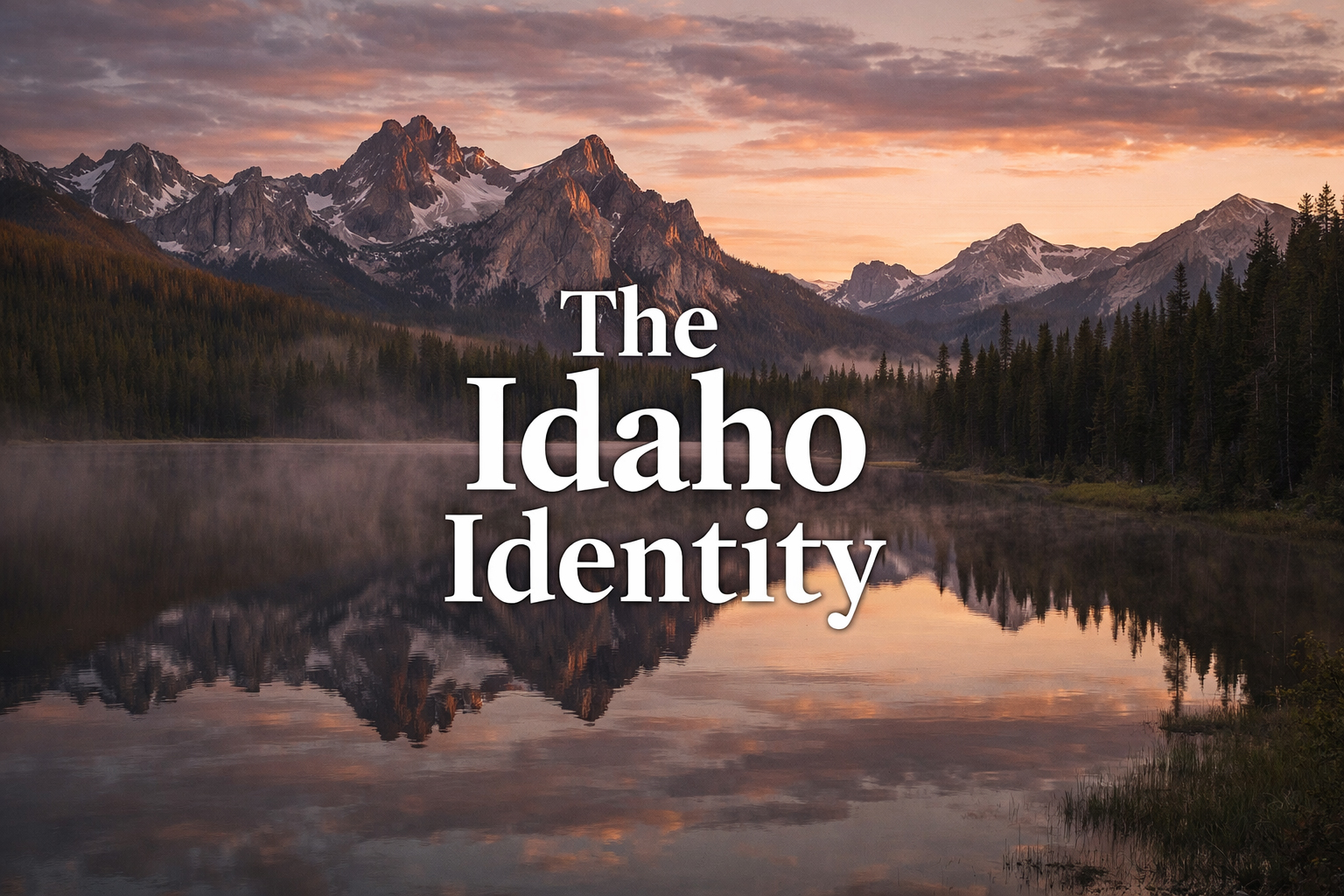
The name itself carries an ambition. The Idaho Identity does not promise simple travel promotion or generic lifestyle content. It promises interpretation. It asks what the state actually is when one looks long enough, reads closely enough, and cares enough not to confuse scenery with meaning. A logo for such a publication cannot be flimsy. It cannot be cute. It cannot look like a sticker, a souvenir, or a tourism slogan masquerading as a magazine. It has to carry editorial seriousness.
That seriousness does not mean stiffness. A logo can be strong without becoming authoritarian, and elegant without becoming mannered. The best identities hold tension. They feel composed, but not cold. Memorable, but not desperate. The Idaho Identity logo should live in that narrow and valuable zone. It should suggest that the publication is literate enough to be trustworthy and visually distinct enough to feel like it belongs to its own world.
A strong logo does not summarize a place. It creates the right threshold through which that place can be read.
Why Idaho Needs a Real Editorial Mark
Many state-themed media projects settle too quickly for decorative shorthand. A mountain outline. A vintage typeface. A sunburst. A river line. A pine tree. A badge. These devices are not automatically bad, but they become forgettable when they are asked to do too much easy work. Idaho deserves something more resolved than that because the state itself contains more than any one scenic symbol can hold. Its identity is not singular. It is layered: alpine and agricultural, severe and hospitable, quiet and dramatic, old-western and unexpectedly modern.
The logo, therefore, should not merely illustrate Idaho. It should frame a publication capable of holding those contradictions. That means the mark must behave with a certain editorial intelligence. It has to look as though it belongs on a masthead, on a feature page, in a footer, at small sizes, at large sizes, beside photography, beside long-form prose, and across multiple regional sections without becoming visually exhausted.
This is one reason the logo matters more than people often assume. It is not only an object. It is a promise about consistency. Once a publication begins building pages on Boise, Stanley, Coeur d’Alene, Sun Valley, the Snake River, hot springs, wildlife, history, and literary place writing, the logo becomes the one recurring visual sentence holding all those tones together.
The Meaning of “News for the Unique”
The tagline matters because it clarifies the editorial attitude surrounding the mark. News for the Unique is short, but it carries the correct provocation. It suggests that the publication is not for generic consumption or lowest-common-denominator state branding. It is for readers who want distinctness, who believe places still differ meaningfully from one another, and who are willing to notice texture, contradiction, and style where a flatter publication would offer only a guidebook summary.
That tagline gives the logo its social edge. It implies that the reader is not merely curious about Idaho, but capable of reading Idaho as a more unusual state than its clichés allow. The logo then has to rise to meet that claim. It should feel selective. It should have a little authority. It should look like something designed for people who notice design.
The Idaho Identity is not trying to look folksy. It is trying to look exact.
Editorial Identity Versus Tourism Identity
This distinction is essential. Tourism identities ask one thing: come here. Editorial identities ask something more demanding: look again. The Idaho Identity is a magazine project, even when it is also useful to travelers. Its logo should reflect that. It is not a campaign mark. It is a publication mark. It does not have to flatter the broadest possible audience instantly. It has to build recognition through repetition, confidence, and association with good pages.
That is why restraint matters so much. If the mark becomes too busy, too illustrative, or too eager, it immediately loses the calm authority that editorial design depends on. The publication itself is already full of visual richness: alpine lakes, lodge evenings, canyon rims, birds in flight, historic figures, hot springs in snow. The logo should not compete with that archive. It should anchor it.
In that sense, the best logo for The Idaho Identity is one that feels slightly like a masthead and slightly like a seal of judgment. Not official in a governmental sense, but assured in an editorial sense. A mark that says: this page belongs to a publication with standards.
How the Logo Works Across the Site
One test of a good identity is whether it can move through very different moods without losing itself. The Idaho site already ranges widely. Boise needs urban composure. Coeur d’Alene needs waterfront polish. Stanley needs twilight humility. The Sawtooths need austere grandeur. The Snake River needs force. The wildlife section needs structure without sentimentality. The food section needs elegance without fuss. The logo has to survive all of those registers.
That survivability is more than a design test. It is proof that the logo understands the state. A weak mark would feel out of place on at least half the sections. A strong one gains meaning from the variety. It becomes more itself the more environments it passes through. This is one reason the logo should remain visually disciplined. Discipline travels better than gimmick.
A Logo for Long-Form Idaho
There is another reason the mark matters here more than on many travel sites: this publication wants to do real feature writing. Long-form pages ask more of a logo. They ask it to hold the top of a page gracefully without collapsing under repeated use. They ask it to sit above 2,000 words without looking either too ornamental or too thin. They ask it to remain stable as the reader moves between place writing, cultural essays, food features, historical interpretation, and visual storytelling.
The Idaho Identity logo should therefore feel built for reading. It should not announce itself so aggressively that it interrupts the prose, nor should it disappear into generic invisibility. The right answer is a logo that opens the page firmly, then lets the page do its work.
A good publication mark should be remembered after the article, not instead of it.
The Larger Argument
Ultimately, the logo exists to support the larger editorial thesis: Idaho is a state of deeper coherence than outsiders assume. The logo cannot prove that on its own, but it can prepare the reader to believe it. It can create the sense that what follows has been gathered under one deliberate eye. This matters. Many regional sites feel assembled. The Idaho Identity should feel authored.
That is what the mark, at its best, contributes: authorship. Not in the narrow sense of a single person’s signature, but in the broader sense of a publication that has decided what kind of lens it will use. The lens here is serious but not joyless, elegant but not precious, western but not costume-bound, literary without losing its practical footing. The logo has to suggest all of that in very little space.
The Idaho Identity logo, then, is not just a header image. It is a compact statement of editorial philosophy. It says that Idaho can be treated as a publication-worthy subject rather than merely a destination category. It says that design matters because interpretation matters. And it says, perhaps most importantly, that a state often dismissed in shorthand deserves a mark designed as though it were worth reading in full.