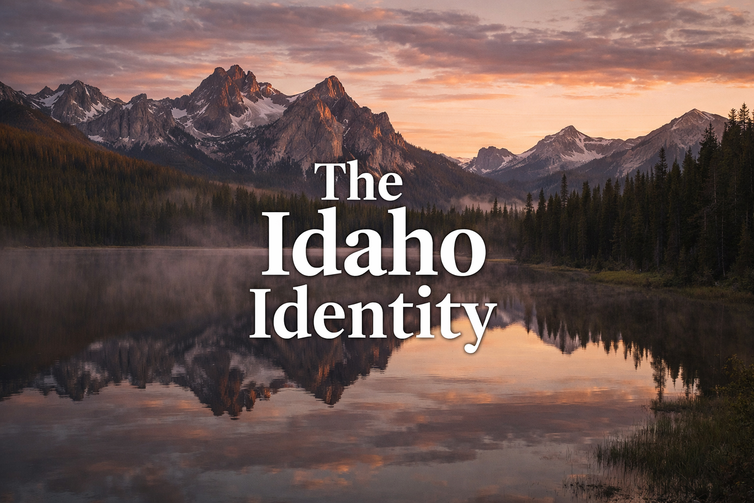
The title matters because identity is the true subject. Idaho does not suffer from lack of imagery. It suffers from oversimplification. People know fragments: potatoes, peaks, rivers, hot springs, trout, the occasional luxury lodge, some vague idea of western space. What is often missing is the connective tissue. What kind of state contains Boise’s composure, Coeur d’Alene’s lake polish, Stanley’s twilight humility, the Sawtooths’ mountain discipline, the Snake River Canyon’s violence, and the white sturgeon’s prehistoric dignity all at once? That is the question this publication is built to ask.
To ask it properly, one needs more than information. One needs tone. Tone is what separates a magazine from a directory. It is what allows a page about huckleberry dessert to feel regional rather than cute, a page about hot springs to feel elemental rather than spa-generic, a page about a logo or masthead to feel like editorial philosophy rather than house notes. The Idaho Identity depends on this distinction. It is not trying to be a database of Idaho. It is trying to become Idaho as an editorial world.
The Idaho Identity is not a claim that Idaho is simple enough to be summarized. It is the opposite: a claim that Idaho is coherent enough to be read seriously.
Why Idaho Deserves Its Own Magazine Logic
Some places can survive sloppy treatment because their public identity is already overdetermined. Idaho is not one of them. It is too often half-seen. That is precisely why it deserves a stronger publication logic. The state has enough internal difference to sustain multiple desks: food, wildlife, history, arts, Boise, Coeur d’Alene, Stanley, Sun Valley, hot springs, the Snake River, the Sawtooths, and the people who shaped or symbolized it. Yet it also has enough tonal coherence that these sections can live together under one masthead without feeling random. That combination is rare.
It means the publication can be sectional without being fragmented. The Boise pages can carry urban proportion. The Coeur d’Alene pages can carry lakefront elegance. The Stanley pages can carry alpine quiet and stopping-place grace. The wildlife desk can carry deep time, severity, and flight. The food desk can carry trout, huckleberry, and farm-to-table restraint. The history desk can carry frontier imagination without collapsing into costume. The result, if done properly, is not a pile of pages but a recognizable editorial country.
That is what this project is actually building. Not a set of isolated features, but a publication ecosystem in which each section teaches the reader a different register of Idaho while still strengthening the whole. The name The Idaho Identity becomes meaningful only when the parts begin resolving into a character larger than any one page.
The Tone: Serious, Readable, and Slightly Defiant
Every publication chooses a tone even when it pretends not to. The tone here is deliberately balanced. It aims for seriousness without stiffness, elegance without vanity, western atmosphere without costume, and literary ambition without self-indulgence. A page should feel more polished than tourism copy, more rooted than lifestyle filler, and more pleasurable than academic exposition. This is harder than it sounds. It requires discipline at the sentence level and coherence at the section level.
There is also a little defiance in the tone, and rightly so. Idaho has been treated too often as material for simplification. The Idaho Identity resists that flattening. It assumes that the reader can enjoy specificity, mood, and long-form attention. It assumes that a state site can be visually refined and verbally intelligent without losing accessibility. It assumes that a publication can be regional without being provincial. These are not small assumptions. They are the publication’s wager made stylistic.
A publication about Idaho should not apologize for having standards. The state itself does not.
The Sections as Different Methods of Reading the Same State
The most exciting thing about the project is that each section becomes a method of reading Idaho. Wildlife is one method: the state understood through creatures of speed, age, altitude, and mystery. Food is another: Idaho understood through trout, huckleberry, farm tables, appetite, and regional restraint. Boise reads the state through proportion. The Snake River reads it through force. The Sawtooths read it through silence. Stanley reads it through twilight. Coeur d’Alene reads it through water and polish. Hot springs read it through earned comfort. History reads it through memory and frontier residue. Arts reads it through the state’s visual and imaginative inheritance.
This sectional structure is not just a convenience for navigation. It is part of the publication’s philosophy. Idaho does not become legible through one master key. It becomes legible through multiple approaches that eventually begin to harmonize. A reader moving between desks should feel that the state is changing register while the publication remains itself. That continuity is the real test of whether The Idaho Identity is working.
Visual Identity as Editorial Discipline
The logo, masthead, and tagline are not decorative extras. They are tools for maintaining the site’s coherence. A publication that ranges this widely needs a visual identity capable of moving through many emotional climates without losing authority. Boise, Stanley, Coeur d’Alene, and the Snake River should not feel as though they belong to different websites. They should feel like different sections of one magazine. That is the work of identity.
This is why “News for the Unique” matters, and why the masthead matters, and why the logo matters. They create the threshold through which the archive is entered. They say that Idaho will not be flattened into generic western content here. They say that each page belongs to a deliberate system. The design is not simply branding. It is a way of making the editorial claim visible.
Usefulness Without Thinness
A strong state publication cannot live on mood alone. It must also be useful. That is why so many pages include real places, addresses, phone numbers, and websites where appropriate. But usefulness is not allowed to become thinness. The site is not trying to become a phonebook with better photography. It is trying to hold practical information inside an editorial frame so that readers get both orientation and interpretation.
This balance matters tremendously. A page on Stanley should tell the reader where to stay, but it should also tell them why Stanley at twilight feels unlike other mountain towns. A page on Coeur d’Alene should tell them where to dine, but also why water organizes the city’s manners. A page on hot springs should tell them where to soak, but also why Idaho comfort feels more earned than fabricated. The practical details are not the end of the piece. They are the service layer beneath the larger act of reading the place.
Usefulness brings the reader in. Point of view makes the reader remember where they were.
The Magazine Idaho Has Been Missing
There is, underneath all of this, a larger ambition. Idaho has long deserved a publication that treated it neither as a niche nor as a joke, neither as a blank nor as a brochure. It deserved a publication willing to say that a state can be read the way a serious magazine reads a city, a culture, or a region: through recurring sections, sustained voice, visual discipline, and an archive that begins accumulating argument over time.
The Idaho Identity is trying to become that archive. Not instantly, and not by proclamation alone, but by repetition of standard. One strong wildlife piece. One strong Boise piece. One strong food desk. One strong Sawtooth page. One strong historical figure. One strong twilight stay. One strong masthead feature. Over time those pages stop feeling isolated and begin forming a publication consciousness. The reader senses not just competence, but authorship.
The Real Subject
In the end, the real subject of The Idaho Identity is not only Idaho. It is attention itself. The site exists because attention changes what a place becomes. Idaho, attended to properly, becomes more articulate, more emotionally various, more stylish, more structurally interesting, and more difficult to summarize lazily. The publication is simply the instrument of that attention.
That is why the title feels right. It names both the state and the act. Identity is what Idaho already has. It is also what the publication is helping reveal. The magazine does not invent Idaho’s character. It frames it, sharpens it, and gives it a recurring editorial home.
The Idaho Identity, then, is both publication and proposition. The proposition is that Idaho is worthy of being read as a whole without being simplified into one thing. The publication is the method by which that reading becomes possible. If the project succeeds, it will not be because it said the state was distinctive. It will be because page after page the reader felt that distinctness for themselves. That is the only proof that matters.