The word masthead still carries something slightly ceremonial, and that is a good thing. It reminds us that publications once understood themselves as more than content systems. They had a front, a voice, a self-presentation, a way of entering the room. In digital media, this sense of entrance is often sacrificed to convenience. Pages become interchangeable. Headers become purely functional. Typography becomes generic. The result is efficiency without memory. A masthead worth keeping resists that fate.
The Idaho Identity especially needs such resistance. Idaho is too easily flattened by lazy visual shorthand. A state reduced too often to a joke, a crop, a mountain outline, or a vague western postcard needs a publication that arrives with enough composure to say, immediately: this will be different. The masthead is where that promise begins.
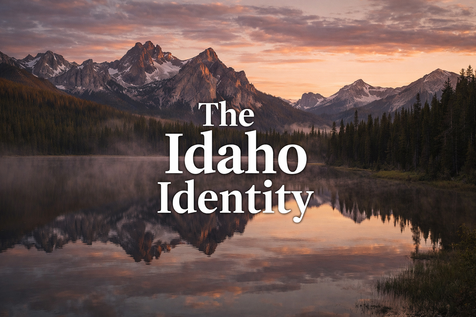
A masthead is not only a name at the top. It is a publication’s first proof that it knows what kind of world it intends to build.
Why a Masthead Matters More Than a Header
A header is often just interface. A masthead is editorial identity. The distinction may sound old-fashioned, but it remains useful. Interface asks where things go. Editorial identity asks what they mean once they arrive. The Idaho Identity masthead has to do the latter. It has to announce that this site is not merely a list of destinations or a generic regional portal. It is a magazine-like project with hierarchy, mood, ambition, and a belief that Idaho deserves long-form treatment.
This difference becomes especially important once the site expands across many sections. Boise needs urban poise. Coeur d’Alene needs lakefront polish. Stanley needs twilight humility. The Sawtooths need austere beauty. The Snake River needs force. The food pages need refinement without fuss. The wildlife pages need structure without sentimentality. The masthead has to be strong enough to sit above all of them and still feel native each time.
That is why a masthead must be calmer than the pages beneath it. It is the stabilizer, not the spectacle. It creates continuity across visual variety. If it becomes too busy, too trendy, or too eager for attention, it cannot perform that stabilizing role. It becomes one more piece of noise. A good masthead should lower the temperature just enough for the whole site to breathe.
The Masthead as Editorial Architecture
There is an architectural quality to a good masthead. It frames rather than crowds. It gives the eye a point of entry and a sense of what kind of proportions will follow. This matters profoundly in a site built around long-form features. Readers encountering a 2,000-word piece on the Snake River Canyon or Idaho’s original character need to feel, at a glance, that they have entered a publication that respects reading. The masthead helps establish that contract.
In this sense, the masthead is almost moral. It tells the reader whether the site intends to behave with self-respect. It tells them whether the work beneath it has been gathered carefully or merely uploaded. It tells them whether Idaho is being treated as a subject of culture or simply of clicks. These are large burdens for one visual element, but the best mastheads carry them lightly.
The masthead should do one hard thing beautifully: make seriousness feel natural rather than forced.
Idaho as Subject, Not Backdrop
This is perhaps the deepest reason the masthead matters here. The whole project depends on the claim that Idaho is not just a backdrop for recreation, but a subject with tone, history, contradiction, and style. A weak masthead would undermine that claim instantly. It would make the publication feel assembled rather than authored. It would suggest tourism first, thinking second.
The right masthead does the opposite. It says that Idaho can bear interpretation. It says that the state is worthy of essays, features, image systems, recurring sections, and editorial distinction. It creates a feeling that the publication has already made a choice: not to chase every generic western visual cue, but to hold a steadier standard. That standard is what gives the site its dignity.
The Relationship Between Logo and Masthead
A logo and a masthead are related, but they are not identical in purpose. The logo is often the more condensed mark: portable, repeatable, able to function in small spaces. The masthead is broader and more atmospheric. It carries the publication name with more ceremony and often works best when paired with photographic or editorial context. On a site like this, the logo gives the brand its compact signature, while the masthead gives the site its opening posture.
That distinction is useful because it prevents visual confusion. The reader should feel that both belong to the same system, but that each has a separate job. The logo says: this is the publication. The masthead says: this is the publication in editorial mode. It is the difference between a name and an entrance.
For Idaho, this matters more than usual because the publication needs both forms of authority. It needs the compact mark that can travel across sections and devices, and it needs the larger visual statement that can turn a page into a magazine page rather than a generic content screen.
The Masthead and Memory
Readers rarely remember mastheads by analyzing them. They remember them by association. The masthead appears above a page they loved, an essay that surprised them, a wildlife feature that felt better written than expected, a Boise page that felt composed, a Sawtooth page that felt hushed and exact. Over time, the masthead becomes the vessel of those accumulated impressions. That is why it should be designed for endurance rather than for one-time cleverness.
Endurance is a subtle virtue. It rarely looks flashy in the moment. But it is the thing that allows a publication to become recognizable over months and years rather than a few seconds. The Idaho Identity masthead should aim for that kind of recognition. Not novelty, but authority that deepens as the archive around it grows.
The best mastheads become memorable not because they interrupt reading, but because they keep returning above work worth reading.
A Masthead for the Long-Form West
There is also something slightly defiant in using a true masthead well in a contemporary regional site. It suggests belief in publishing as craft. It suggests that design is not merely a wrapper for utility but part of the reading experience itself. For a site devoted to Idaho, this is particularly right. The state’s strongest qualities are rarely loud. They are shaped, patient, exact, and capable of surprising depth. A masthead built with those same values becomes more than a design element. It becomes a form of alignment between subject and presentation.
The Idaho Identity masthead, then, should be understood not as ornament but as editorial infrastructure. It gives the site a top edge worthy of the pages beneath it. It says that Idaho will be treated with style but without vanity, seriousness without stiffness, and visual discipline without coldness. It tells the reader, before the first paragraph begins, that the publication believes places still deserve to be read with care.
That is ultimately what a masthead is for. It does not merely crown the page. It establishes the publication’s terms of self-respect. And for a magazine built around a state too often mistaken for simplicity, that first act of self-respect matters immensely.